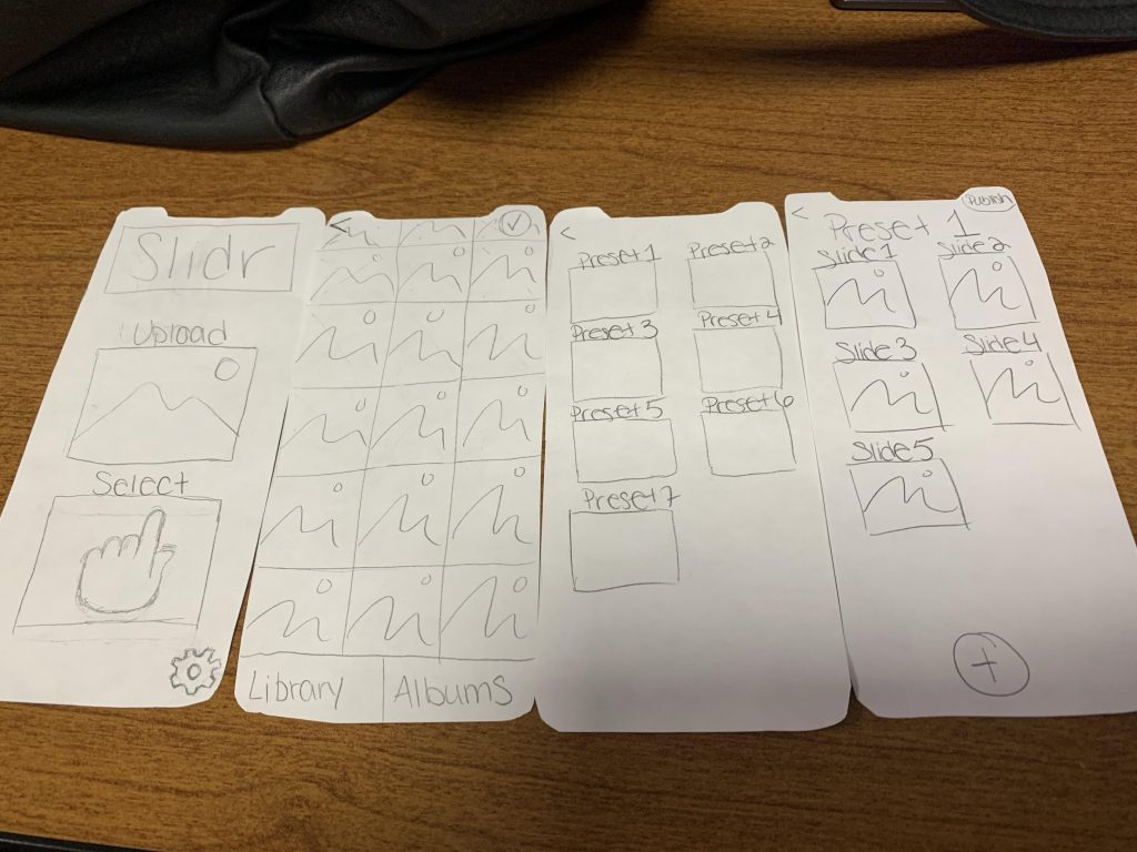
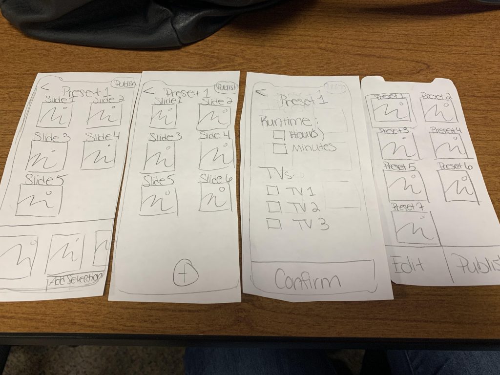
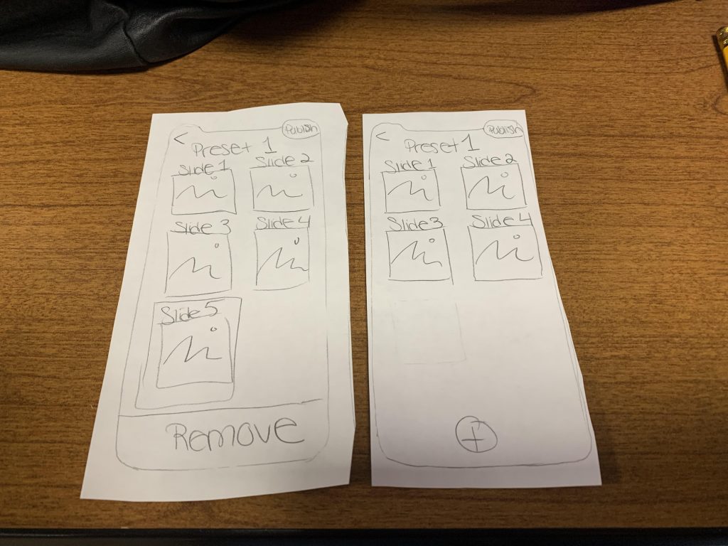
Three main tasks were written out to make sure the user could navigate through the app as intended.


A lo-fi (low fidelity) mock up of how the app was to be laid out was created. This was drawn onto paper and cut out into pieces to be able to place and take away screens, to simulate the actual usage of the app.


